Finished up on this illo after it taking a while longer than expected! I have to say I'm really happy with the outcome - especially in contrast to the mammoth Trumpeters project. I think the simplicity is really successful & the textures are just about right. I'm reckoning that this only took 2 hours to sketch and then redraw in illustrator and then perhaps 6-8 hours of finishing (!) in Photoshop.
I've had quite a few questions from people about the texturing and how it's achieved so I thought I'd share a more detailed process description to clarify things in the hope that it helps some fellow arty types out :)
Step 1 - Composition
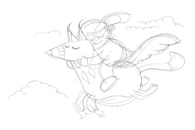
As covered in a previous post, this is how I'll be starting almost every piece from now on, start with small thumbnails to get the composition exactly right. It gives you more confidence in the piece from the start!Step 2 - Into Illustrator
Pull in the scanned thumbnail and start tracing! In my case, I like to keep most of the shapes on separate layers to keep things flexible. I really like using the Blob brush in CS4 but for this illo I wanted more angular shapes so I stuck more to the Pen tool... Once the shapes are pretty much 'right' I export the document to a Photoshop PSD to retain the layers. I pop back to illustrator when I need more shapes but now it's time for a lot of Photoshop work. You can see that the colours are already pretty close to the final image but I'm not really worrying about that at this point.
Step 4 - Photoshop texturing and finishing
Personally, I'm not keen on how clean the finish is with vector images so I know the major work is going to happen in Photoshop.
Firstly, I want to break up the shape edges to make them look as natural as possible. It's quite laborious but I like to do this by 'hand drawing' ALL of the shape edges with a Wacom and Photoshops brilliant brushes...
Generally, I like colours to stay solid - so I have the brushes set so that the Wacom pressure only effects the 'width' of the stroke - NOT opacity or other stuff.

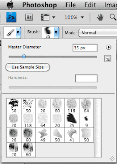
I start with a good natural finish brush. I then play with the parameters in the Brushes palette... As mentioned, set the Shape Dynamics to "pen pressure" to get the variation you want with the Wacom. I also like to add a little bit of 'Size Jitter' to add random bits outside of my control and I tend to make it a bit more haphazard by adding a fair amount of 'Scatter' here too - The beauty of this palette is that you can just PLAY and see a preview of what you're going to get.
I add on a 'Texture' ... I'm not sure exactly what can be achieved with these yet but they help get the feel I want.
The final parameter I rely on is 'Dual Brush'... It lets you add another brush to the one you're using to get really good natural effects. PLAY with this :)
Actually, what I'm doing is trying to take away a lot of the 'accuracy' that makes digital work so obvious.
Once I'm happy with the brush effect I simply trace over the edges of shapes I've imported from Illustrator. This may seem like a long-winded way of doing things - Ai custom brushes can do this at the click of a button! - but the finish is so much more 'natural' like this.
On this piece there are some subtle shading lines within the shapes too - I use the brushes here too - simply select the shape, pick a slightly darker hue than the one being painted on, create a new layer on top of it and set to about 20% opacity... and paint away...
Now, the final 'environmental' finishing textures. This stuff is made up of lots of scanned textures, overlayed, coloured, with different layer effects (mutiply, screen, opacities). It's a good idea to have a library of your own scanned textures - they're quite fun to make too... I used 5 or 6 different scans like this on the final illo:
It's a good idea to have these in simple black and white, it makes them easier to colour up properly inside your document.
Then it's all about adjusting colours, hand finishing/erasing textures and burning stuff in.
And that's about it! I hope that makes some sort of sense... apologies for the HUGE post, I didn't expect it to be that long :D
Feel free to drop me a line if I haven't covered something you wanted to know...


